An Investor Relations website is the critical channel through which to communicate educate and engage with investors. It should be more than a demonstration of compliance with the Corporations Act 2001 and a listed company’s disclosure obligations. It is a gateway through which to tell a company’s investment story so it is equally well understood by an analyst, journalist or retail investor.
Being all things to all investor audiences may sound like a big ask but following some key best practise guidelines will allow your investors explore the information that is relevant to them. We have pulled together our top 5 tips for making an IR website, whether stand alone or as a section within the corporate website, an accessible and compelling forum to share a company’s investment thesis.
Make it mobile
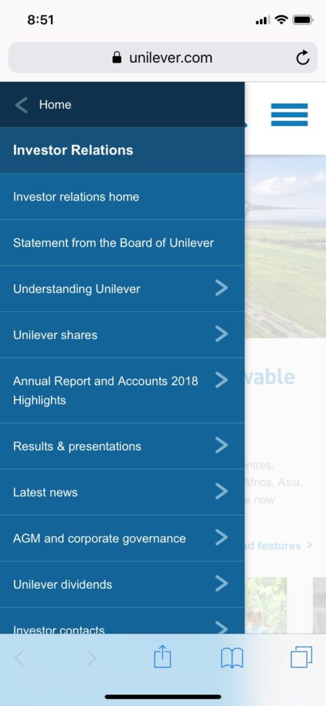
 The sophistication of smartphones and tablets means more and more analysts, institutional investors and individual shareholders are accessing corporate websites and the IR sections from mobile devices. It is critical that a company’s website is mobile enabled and that the IR section is easy to find and to navigate. Including a ‘cascading’ or drop down menu that displays when the IR page loads on a smart device will help users easily and quickly find the information they need.
The mobile version of Unilever’s global website is a good example. A key tip for making IR information mobile optimised is to make sure it is available in HTML as well as PDF. PDF’s can be fiddly when accessed via mobile devices.
Results archive
Analysts and investors want fast access to results information, particularly once they have navigated to the IR page. It may sound obvious but clear simple navigation to a results archive is a must have. Once a user is there make sure there is a deep, rich and logical archive. A tabbed table works well where there is a clickable tab for each year.
The trick with results archives it to make them go back as far as possible, stripping out older material in pursuit of a simpler, cleaner archive can frustrate investors trying to get up to speed on historic announcements or events.
Under each year tab use standard icons to highlight the types of material that are available. Zurich Insurance do this well.
If possible use rich media such as audio or video webcasts and include indexing or chapters within the webcast and a transcript, many investor value being able to jump to a specific area of interest rather than listen to a full webcast.
Provide a company and industry overview
The company overview section of the IR website is a useful tool for analysts researching a company for the first time. It should include financial data covering several years and information on strategy, business model, divisions, structure, risk management, ESG targets and market environment. There are also opportunities to leverage the interactivity of the internet and include interactive charts with additional information overlays, such as key announcements. German Pharma company Bayer is a good example.
If you are in a niche industry, then include background on the industry itself and why it represents an investment opportunity. Canadian crop company Nutrien’s has some good industry background.
A key to helping investors understand your business and industry is to cut out jargon. Clearly there will be times when dense or legal language is unavoidable, such as governance and disclosure articles, but where possible use plain English, especially in FAQ’s. It will send a message of openness and transparency and be appreciated by less sophisticated, individual shareholders.
Use rich media and interactivity
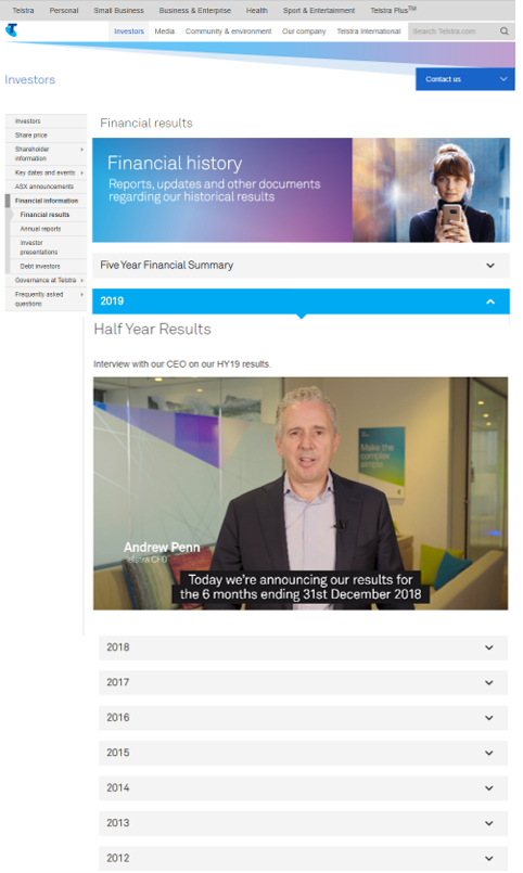
 Video content around results can be a great way of focussing investors on key takeaways and is also a good introduction to the deeper information within the IR website. In addition, video gives the impression of openness, transparency and willingness by senior management to make time to engage with investors. Telstra have a good track record on using video for IR:
Make sure to include downloadable excel spreadsheets of key financial data so analysts can access and manipulate the data. BP does this well.
When using PDF’s incorporate hyperlinks to aid navigation in the document so users can jump to the sections that interest them or click out to additional online information. German car maker Daimler’s sustainability report PDF is a good example.
Another aspect of interactivity is making sure to include clear navigation back to the rest of the corporate website, to allow investors easily find the latest media press release or a senior executive’s biography in the ‘About us’ section.
Comprehensive IR contact details
Giving prominent and detailed contact information on IROs, is not only helpful but, again, supports the impression of openness and transparency. A key to this is making sure the ‘IR contacts’ link is always accessible wherever a user is on the IR website. It is also important to include the individual IROs name, phone number and e-mail address.
Using a photo of each IRO also helps, and make sure any international dialling codes or time zones are included, particularly if you are targeting overseas capital. Shell has a IR contact section that includes photo, Biographies and the languages the IROs speak.
Conclusion
It is likely that most Company’s, which have an IR section to their website, will already do doing some of the things we’ve outlined. A good first step to finding out how to improve your on-line IR resources is to get FIRST Advisers to conduct an audit and benchmarking project to identify what is already working, what more can be done and what are your peer group doing that you are not.